
March has been a bruising month so far. Energy bills are climbing, markets are rattled, and the conflict in the Middle East is casting a long shadow over an already anxious global mood. At times like these, it might seem frivolous to talk about typefaces. But actually, I’d argue the opposite.
Design that is thoughtful, durable and rooted in genuine craft matters more than ever during periods of instability. And this month’s typographic releases make a persuasive case for that position.
A compelling theme emerges across several of the strongest entries: the past as raw material. Neville Brody reaches back to revolutionary agitprop and constructivist brutalism. Fred Wiltshire riffs on an 1880s Herman Ihlenburg display face. ALT.tf revives lettering from a 1972 feminist text. Rubén Fontana synthesises centuries of calligraphic tradition with sculptural precision.
In each case, the historical reference functions as a starting point, not a destination. Perhaps it’s no coincidence that, in uncertain times, designers find themselves reaching for anchors.
Elsewhere, systems thinking dominates. Mark Caneso’s Please evolves across three subfamilies, each carrying a distinct typographic voice. CoType’s Aeonik Soft extends an established, well-respected superfamily into an entirely new emotional direction.
Whether you’re drawn to display faces with genuine cultural backbone, type families built for tomorrow’s interfaces or serifs that balance formal ambition with everyday utility, there’s plenty here to hold your attention.
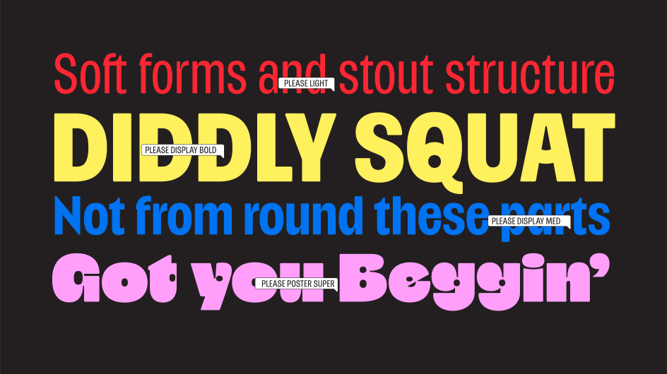
1. Please by Mark Caneso
Please began with a single letterform. For Mark Caneso of ps.type.lab, it was the double-storey lowercase ‘a’; specifically, what happens to it under extreme weight. As the heaviness increases, the letter’s counters begin to close in on themselves. Rather than fight this structural inevitability, Caneso leaned into it: merging the counters and asking whether the result still read as an ‘a’, and whether that even mattered if it looked compelling. That single experiment became the organising logic of an entire family.
The result is a type family of three distinct subfamilies—Please, Please Display, and Please Poster—each with a slightly different default character set and, therefore, a slightly different typographic voice. Rather than burying alternate glyphs in stylistic sets, Caneso built those variations directly into separate font files, making it straightforward to find the right flavour without hunting through OpenType features. Proportions also shift across the weight range: lighter styles feel gently condensed, whilst heavier styles relax toward more expansive forms, even as the overall character stays compact throughout.
At the extreme end—the Poster subfamily, running from Heavy to Jumbo—things get, as Caneso puts it, “delightfully strange”. Exaggerated counters and bold shapes produce forms that hover between familiar and alien, functional and purely expressive. Ultimately, Please rewards those willing to push it, offering one typographic personality at comfortable display weights and an entirely different one at the limits.
2. BF Popaganda by Neville Brody
Originally developed as part of Neville Brody’s editorial design for Arena Homme+, BF Popaganda arrived at its form through an idea of concrete poetry: treating words and characters as heavy,