

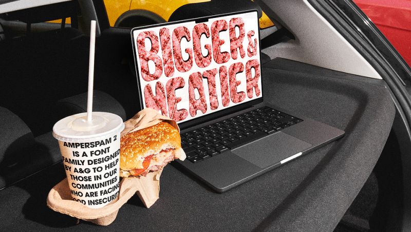

Right now, no one’s quite sure if we should still be saying ‘Happy New Year’ or not. But one thing’s for certain, January’s releases have properly impressed me. There’s a refreshing lack of faff here; these are typefaces that know exactly what job they’re meant to do, and they get on with it. No apologies, no hedging. Just confident, well-considered design that actually solves problems.
Many of these fonts engage with history in meaningful ways. We’ve got a 126-year-old script that’s been lovingly resurrected from archival specimens; a serif based on the typography of an 1830 abolitionist manifesto… and these aren’t just aesthetic nods to the past. They’re active conversations with it; preserving something important whilst making it relevant for today.
There’s also a lot of sheer practicality on show. A corporate sans that somehow manages to feel warm and human. A comprehensive serif system spanning 224 styles (yes, really). A display face inspired by ocean waves that actually captures that sense of organic movement. These typefaces work hard, but they’ve all got personality in spades.
What ties all this together is a refusal to choose between functionality and character. Every font here proves you can have both: that being useful doesn’t mean being boring, and having a distinctive voice doesn’t mean sacrificing versatility. Which, frankly, is exactly what good type design should be about.
1. GT Canon by Grilli Type
GT Canon represents Grilli Type’s answer to a deceptively simple question: what should a contemporary serif be? Rather than reaching for stylistic reinvention or nostalgic reference points, the foundry has delivered a comprehensive system built around pragmatic functionality and modern requirements.
The family’s scope is genuinely impressive: three optical sizes, seven weights, five widths, italics and a monospaced companion, totalling 224 styles. This isn’t expansion for its own sake, but a deliberate architecture designed to handle whatever contemporary design demands. Together with GT Standard, its sans serif sibling, GT Canon forms a complete typographic ecosystem.
Most of all, what distinguishes GT Canon is its refusal to achieve versatility through blandness. The design maintains personality across its extensive range—movement and liveliness are embedded in the letterforms themselves, creating what Grilli Type describes as being “free of nostalgic connotations”. This is a serif firmly rooted in the present tense, addressing what digital contexts require of typefaces today rather than what they needed yesterday.
The accompanying minisite frames the release through an alphabet of aesthetic terms, functioning as both specimen and theoretical exploration. It’s an approach that mirrors the typeface itself: systematic without being sterile, functional without compromising character. GT Canon succeeds as both a workhorse and a voice, demonstrating that contemporary type systems can serve multiple roles whilst maintaining a coherent identity throughout.
2. WTF Forma by W Type Foundry
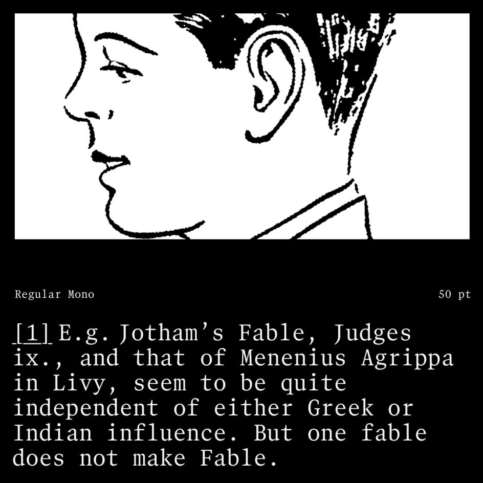
Magdalena Arasanz and the team at W Type Foundry set themselves a challenging brief: create a typeface for big corporations that actually feels human.