
Boom Briefs, if you haven’t come across them before, are our monthly creative challenges: fictional briefs designed to get your ideas flowing, stretch your skills, and, if you fancy it, share what you make with a community of like-minded designers. No client feedback, no revisions, no stakes. Just pure creative freedom.
February’s Boom Brief asked our community to do something deceptively tricky: brand an independent florist. Anyone who’s wrestled with a brief like this knows how easy it is to slide into cliché—the spindly script, the blush-and-sage palette, the predictable petal motif. We wanted to see something better. And our community absolutely delivered.
Our fictional business, Petal & Stem, was founded by two best friends who left their day jobs to follow their passion for seasonal British blooms. No imports, no filler flowers: just what’s growing right now. The brand needed to feel warm but not cutesy, independent but not amateurish, modern but rooted in nature. Under the hashtag #cbbriefpetalandstem, designers from London to Budapest, Paris to Warsaw, all brought something genuinely different to the table.
Here are the entries that stopped us in our tracks.
Folk craft meets pixel art
The most conceptually adventurous entry came from Swedish graphic designer and illustrator Josefine Jälmevik. Rather than reaching for the obvious visual language, Josefine drew a parallel between two crafts: floristry and embroidery. Both are communal, tactile and generational; traditions passed through hands, not manuals.
Josefine’s central emblem takes the form of a pixelated ornamental motif, referencing cross-stitch and folk pattern-making, with a subtle digital undertone that keeps it from feeling purely nostalgic. Two figures gather around a wildflower at the heart of the design, representing the shop’s founding friendship. This is paired with a bold, confident wordmark that anchors the delicacy of the ornamental detail.
Tissue paper, packaging and stationery are decorated with lace-like stencil patterns built from the logo. It’s branding that rewards close attention… and that’s exactly the point.
The P.S. that changes everything
Perhaps the most emotionally resonant entry came from Kate Ross, a marketing and creative director based in Kansas City. Her concept hinges on a single, quietly brilliant observation: Petal & Stem’s initials are P and S. And P.S., of course, is what you write when you can’t quite bring yourself to say the most important thing in the body of the letter.
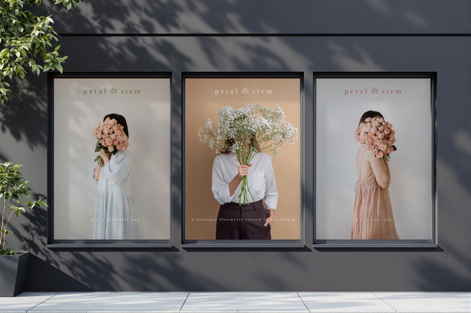
From that starting point, Kate built an entire tonal world around the idea that flowers often say what we struggle to put into words. Her campaign line—”p.s. I love you &”—runs through the identity like a thread, appearing on wrapping paper, ribbon, gift boxes and aprons. The ampersand at the end is doing something clever: it holds open an infinite space for whatever the recipient needs it to mean. The brand speaks for you so you don’t have to.
Kate also wove a community dimension into the brand story: every purchase comes with a single loose stem,